What’s the biggest font on Google Docs? This is a good question, and the response is probably it depends. It depends on what you mean by biggest.
You can be interested in the max font size you can enter in the font size toolbar option, or you may be interested in the font that takes up most space on your page.
I made some tests and tried to figure out the answer to both questions, let’s see the results.
What’s the biggest font size on Google Docs?
This is the easy question, so let’s get the answer and move on to the tougher one.
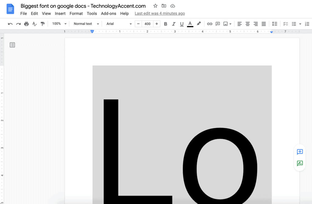
The largest font size you can enter on a Google Docs document is 400. If you try to manually enter a bigger number in the Font Size box in the toolbar, it’ll be dialed down to 400. There’s no way to make it bigger.
Here’s a screenshot of how big it is on a document.
What font takes up more space on Google Docs?
This is the big question maybe you’re asking yourself.
You’re probably in a situation like: I have to write x pages, I am restricted to using a 12 font size. And you’re asking yourself (and to me of course) what’s the font that takes up more space so I can fill the x pages writing less content.
There seems to be no direct and researched answer to this question online, everyone seems to talk about the font, and make suggestions, but no one tested through the Google Docs font list to see what practically works. So I started my research for the largest font
How I made the test
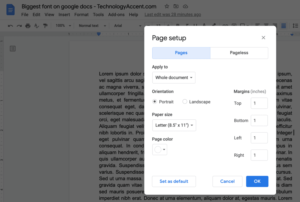
To make a “real-life” test, I made this document:
- Google Docs standard document.
- Letter Paper size.
- Portrait orientation.
- 1-inch margins on all four borders.
- 12 points Font size.
- Line spacing is set to 1.15. I should have set this at 1, but I forgot to check before starting the text.
- Added about 1000 “Lorem ipsum” words to fill more than one page from an automatic Lorem ipsum generator.
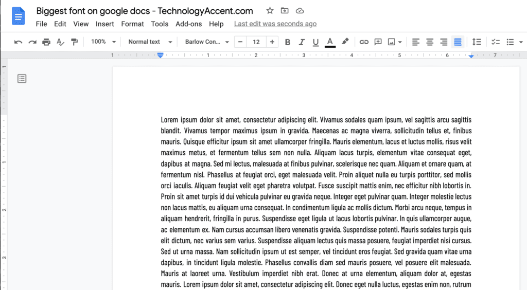
In this way, I have a document with a standard, average-looking, text on it, with a common font size.
From this base, I selected various fonts and wrote down the number of words and characters on the first page when using that character. To get the counts I selected the text on the first page and used the Tools -> Word count tool.
The results got into a Google Sheets document.
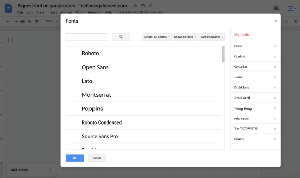
As we already saw on the Harry Potter font page, there’s no way to add custom fonts to Google Docs, but the list of included fonts is pretty long, so I started by sorting the list in order of popularity and tried to include at least the more popular and well-known.
I used always the “normal” option if available, so avoided bold and other variations.
General considerations after testing more than 100 fonts
After finishing the test with over 100 different fonts available in Google Docs, I started to get some helpful insights.
If you like a Font with a serif and a Sans version, you should prefer the Serif one. The Serif takes some extra space in the characters, so it results in an overall longer text compared to the Sans version of the same font. The reason is intuitive, but a good thing to keep in mind when selecting your font if you want the text to seem longer.
If you need your text to seem longer absolutely avoid “Condensed” or “Narrow” fonts like Roboto condensed or PT Sans Narrow. As the name suggests, they are compressed fonts, specifically made to have characters with a small width, so definitely not what you’re looking for.
Mono fonts tend to get few words per page, as having all the characters with the same width, and i takes the same space as an o.
Most of the fonts getting the fewer words per page are “strange” fonts, so in many cases, they are not very suitable for a formal text. There are, however, some good fonts you can select with decent spacing.
The results – And the winner is…
Taking into consideration the words in a single “Lorem ipsum” page, the winner of this text is:
Syncopate
Let’s see what this font looks like:
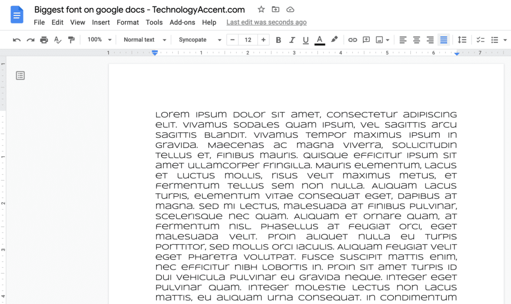
This font got a “score” of 303 words on one page. This is great, but as you can see there are some great drawbacks:
- The font is a mix of capital and non-capital letters. For example, capital L is equal to non-capital l.
- All the letters (capital or not) are about the same height, so it’s difficult to understand which letters are capitalized.
- This font is not easy to read, probably someone with reading problems will struggle to read it.
- Let’s be honest: Syncopate doesn’t look formal or professional.
So the first is not a great result. Let’s look at other options.
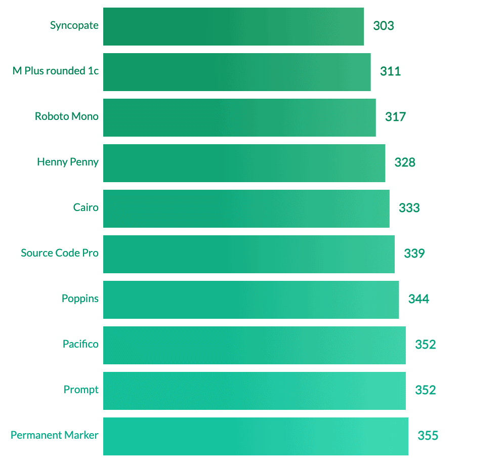
The runner-up is “M PLUS rounded 1c”, with 311 words on a page. Let’s see an example of this (never known to me) font.
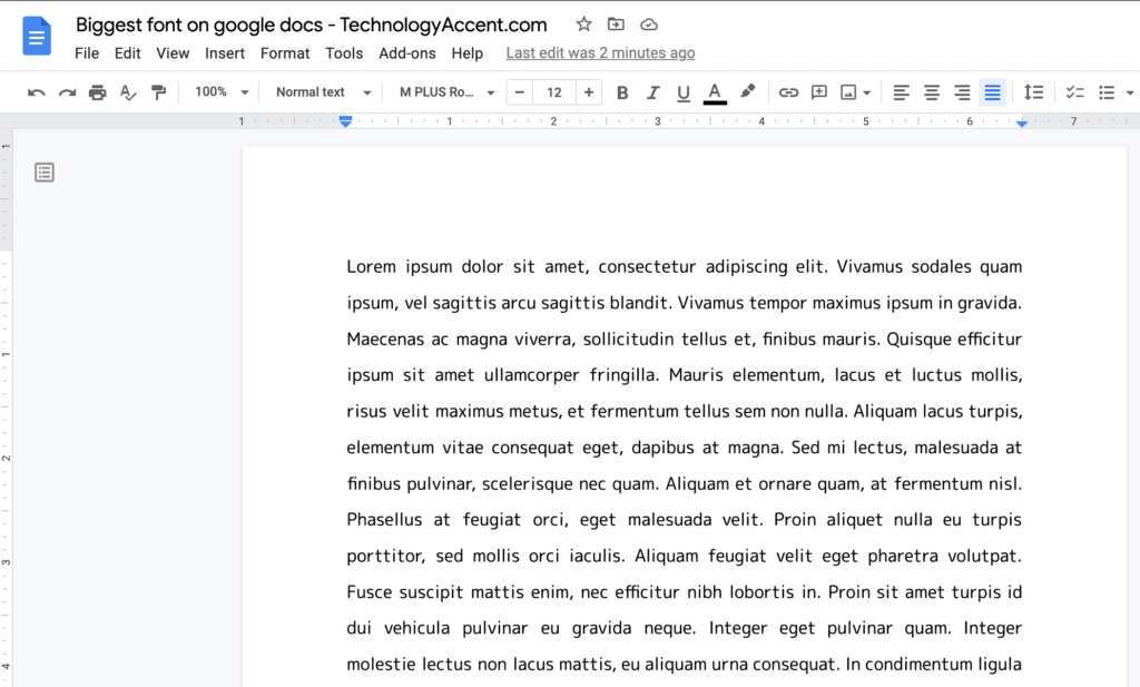
This seems really a good choice. It’s probably due to a big line spacing, with 26 lines on a page it’s definitely more spaced out than the 41 lines/page of Arial. If the only constraint is you have to write with x points as font size and you can’t manually change line spacing, then this could be a good choice.
If you want to get more data, here’s a screenshot of the Google Sheets with all the data.
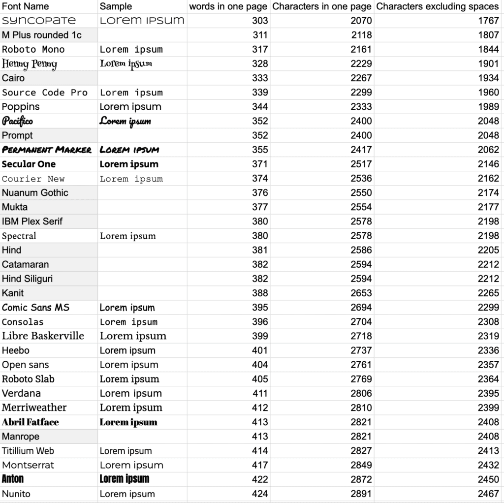
If you want to view the full spreadsheet with all the tested fonts you can get it at this link.